Simonetti Lab Redesign

Project Brief
I was connected with Dr. Simonetti, who conducts research at my alma mater, Johns Hopkins Universty.
He asked me to redesign his lab’s website with a few key goals:
to have a digital “business card” for his lab,
to attract graduate students at the university to join his team,
and to store relevant information in an uncluttered fashion.
For Dr. Simonetti, it was very important that his website be mobile friendly, as he communicates frequently within the science community via Twitter and knows most people interested in his work will access his site from a mobile device.
Below are the highlights of my observations:
There are issues with visual hierarchy as a result of too much white space and inconsistent font sizes, making scannability difficult for busy students and potential funders.
The site is organized in a way that spreads information between multiple pages. Since Dr. Simonetti wants a minimal website, there are opportunities to reorganize the content in a simpler way.
Although the site should be minimal and professional, the current design of the site lacks the personality to help Dr. Simonetti’s lab to stand out in the academic space.
I decided to focus my redesign on the visual hierarchy, organization, and brand design of the lab’s site.
Information Architecture
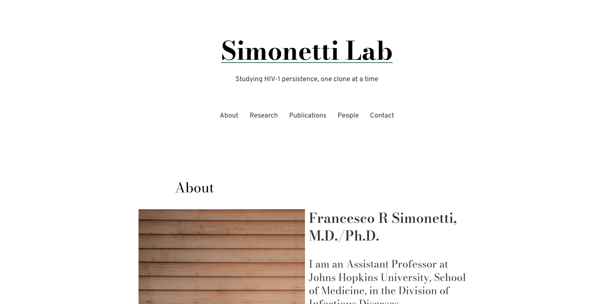
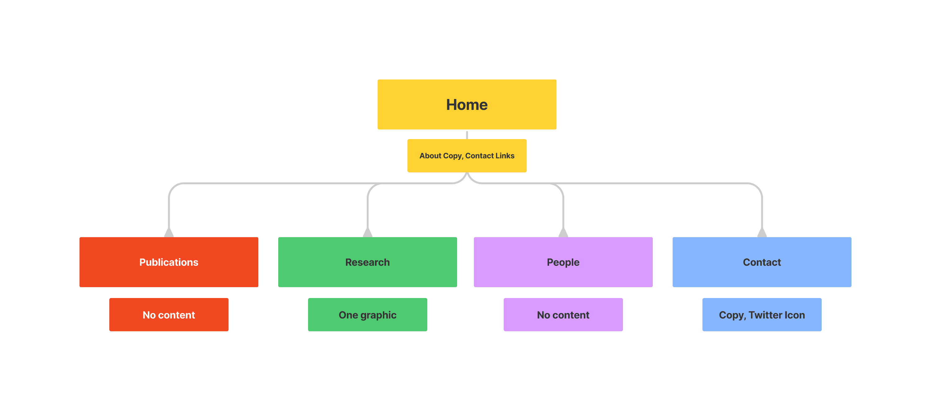
The orginal organization of the lab website led to duplicate information and related information spread between mulitple pages.
For example, the Home page contained multiple contact links, including email, Twitter, and Google Scholar, but the dedicated Contact page only included a Twitter link. Additionally, information about Dr. Simonetti himself could only be found on the Home page and not the People page, which I found confusing.
I solved for the existing issues by moving Dr. Simonetti’s bio to the Team page, as well as new copy related to the lab’s philosophy. I kept more high-level information about the lab on the home page to serve as an introduction the lab as a whole. I combined the Research and Publications page into one so that visitors might grasp an idea of what the lab studies, with the option to dive into the published literature.

UI Design
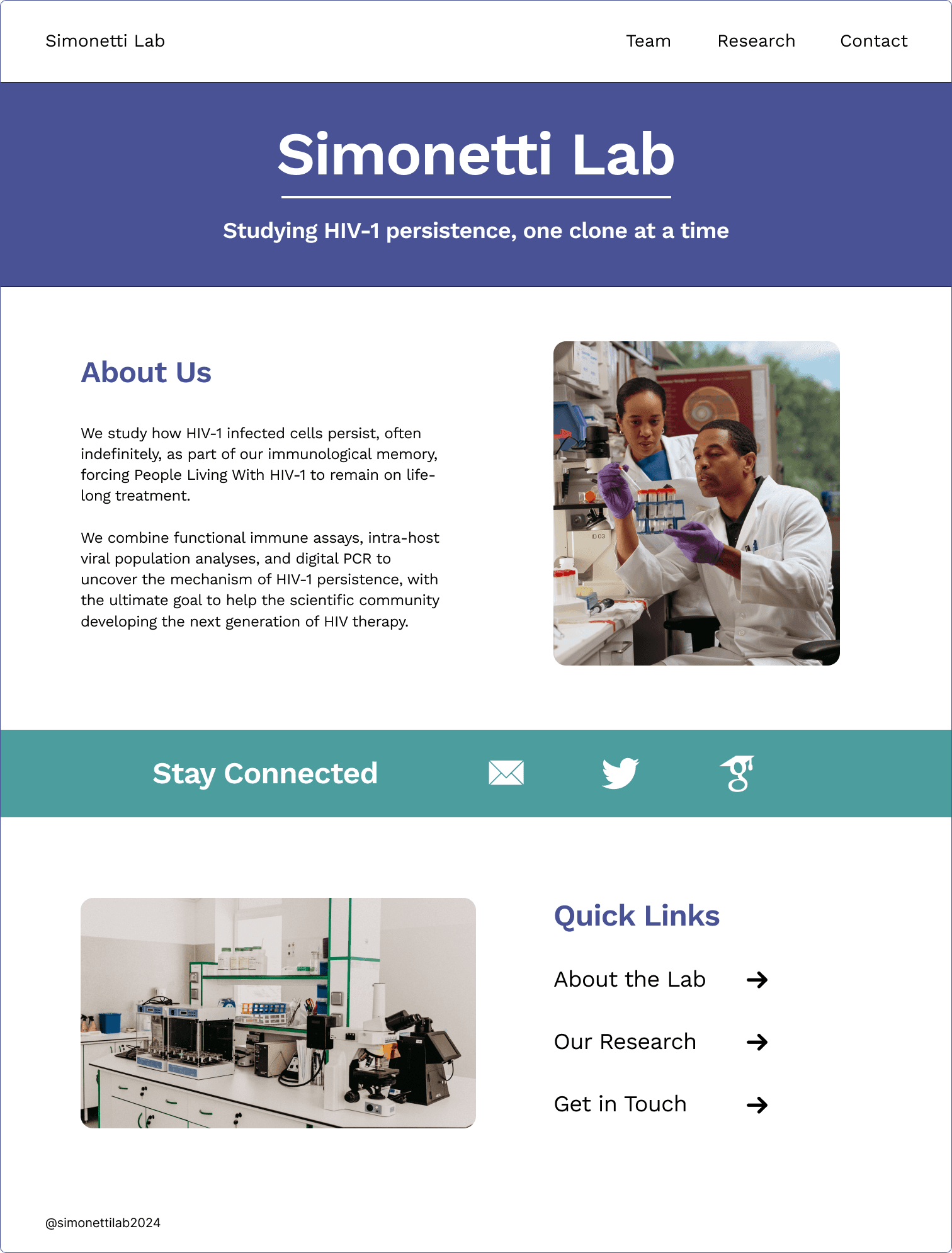
To bring some life to the site, I used a color palette that Dr. Simonetti mentioned was his favorite, which also happens to be very accessible to users with color-blindness.
From this palette, I created color styles in Figma and decided on the font family Work Sans, as it great for readability at smaller fonts and conveys a personality of playful professionalism.