Gisou Loyalty Program
Project Brief
Gisou's digital team developed a strategy to improve the Gisou loyalty program and asked me to assess the user research and redesign the loyalty program on Gisou's website. My goal was to make the program look attractive to potential repeat customers and to create assets that can be applied throughout the website to bring users to the loyalty program page.
Review the Materials
I started this project by reviewing the digital team’s report on the Loyalty Program Strategy.
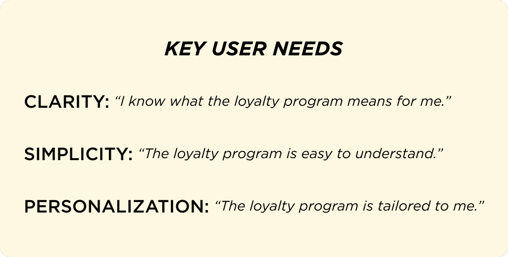
My key takeaways from the report were that Gisou's users value clarity, personalization, and simplicity when choosing to sign up for a loyalty program,* and that future iterations need to address these needs.
*Findings based on survey research.
Wireframing
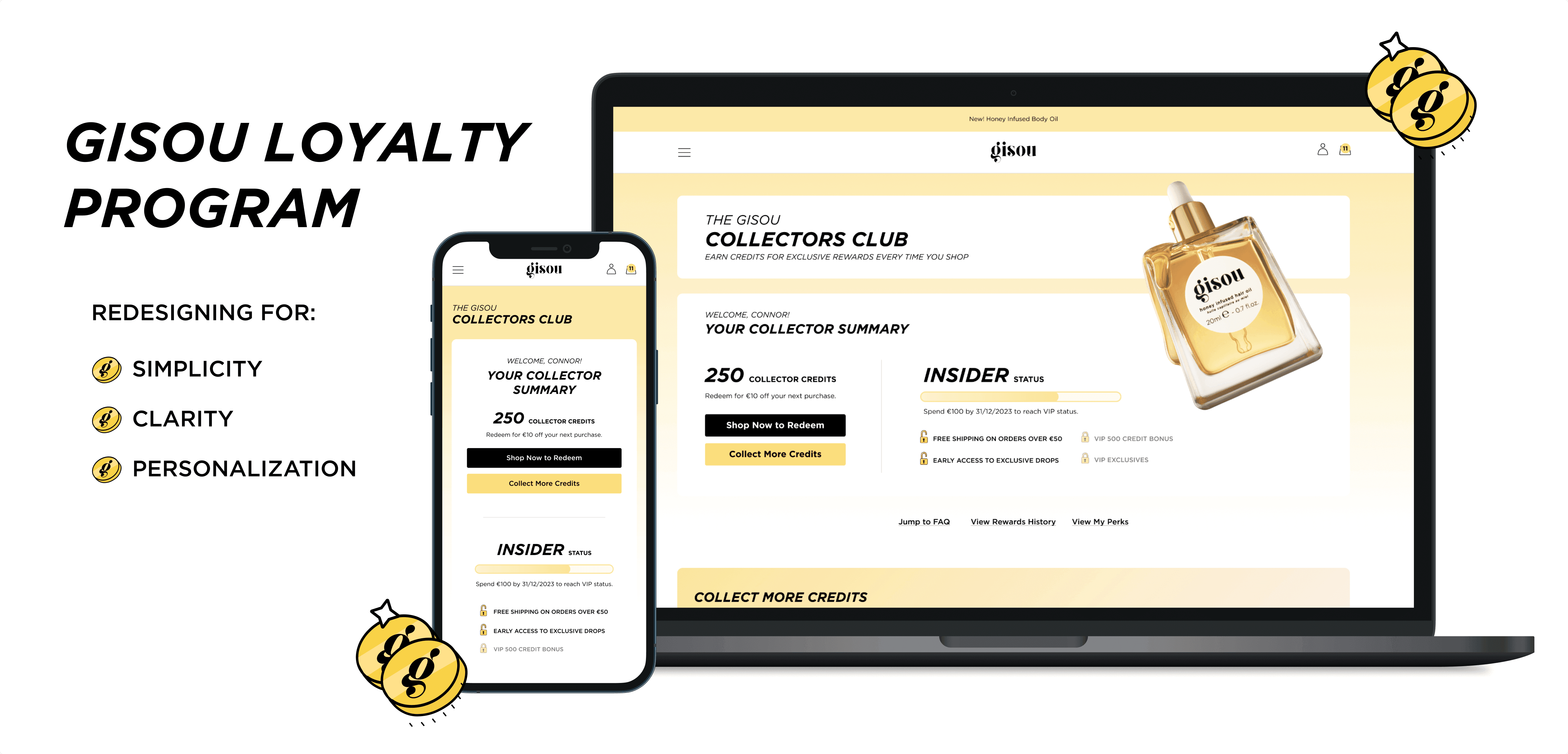
My process here was to take apart all the essential information that belonged on the account page and piece them together in a way that addressed the core user’s values.
I wanted to clarify the difference between credits and status, 2 concepts that were not clearly different in the original design.
I grouped the number of credits, their expiration date, and cash value together and the user’s tier status, progress towards the next tier, and their current tier benefits.
To address the project goals of increasing redemption rate and user mobility through tiers, I included 2 things.
First, I added the CTA, which will promote users to shop to redeem their credits (and earn more!)
Next, I added locked benefits to entice users to spend more in order to move into a higher value tier.
Additionally, I incorporated some visual communicators like the progress bar and a line to separate the two concepts.

Result
After some feedback from the Designer Manager, Sam, I made a few tweaks to the design for the final version, inlcuding changing the order of the credits & status tiles. Sam wanted to emphasize credits over status in the mobile design, so to make the desktop design more responsive for the developers we placed the credits to the left.
I want to give a shout out to the graphic designers at Gisou, who quickly designed some awesome locked/unlocked icons for me! I think the use of the icons with the list of perks brings even more clarity and style to the design.

Other Redesigns
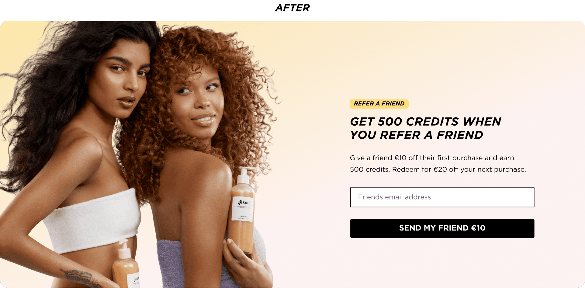
Here I got a chance to flex my UX writing skills. I surveyed the sight for the ‘Refer a Friend’ callouts and found that the information was very inconsistent. For example, some of the text promised a €10 reward, where others promised €20, without including that the customer would be rewarded with credits to redeem for a discount.
To add clarity, I included a straightforward header: ‘Get 500 credits when you refer a friend.’ I wanted to emphasize that the credits were the reward and spell out how much of a cash reward that equates to. I also updated the flow of the referral process so that the CTA button would be punchy and enticing: ‘Send my friend €10’ instead of ‘Next.’